BRAVO 20

Monday, June 23, 2008

Plans and Pola


Since I returned from Pakistan I feel a great drive to photograph. My hands are literally itching. Summer holidays are approaching and the coming five weeks will be largely devoted to photography. In a few hours I will travel to Tällberg, a little village 3 hours north of Stockholm. I will be part of a conference that brings together around 400 invitees to reflect on the question "How on earth can we live together?". This will be a learning and networking experience. Judging from the list of participants there will be many interesting people (Kofi Annan, Desmond Tutu, ...). That is why I am taking my Rolleiflex with me (as only camera) with 20 rolls of Fuji 160S colour film. My intention is to try and shoot as many portraits as I can.

Then after that it is more or less straight into the family holidays. We're planning to stay away for a month. First to Italy, then visiting friends in the French Alps and finally two weeks at our place in the south-west. The Italian leg of the trip is devoted to the Valtournenche, a valley which culminates in the great southern face of the Matterhorn (Cervino). I am taking my 4x5" setup to make a few pictures of the most photographed mountain in the world. Apart from this little LF study, I will stick to 24x36. My plan is to shoot a dynamic travelogue of us, as a family, moving around. I am taking quite a bit of gear with me: two Hexar bodies with a 28/2.8 (the Zeiss Biogon) and the Noctilux, the Contax RTF with two telelenses (the 85/1.4 and the 200/3.5) and likely I will also take the XPan with the 45 and the 90mm lenses. Finally, I may for a change put the M2 with the CV 15/4 in the bag as well. And plenty of film: Efke 100, Tri-X 400 and Neopan 1600.

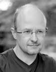
Talking about 4x5": today we visited friends and in an impulse I grabbed the Graflex with a Pola back and a box of 54. Pola's dead. Factories are closing down. I have a little stock of 54 and 55 in 4x5" but it's dated and I need to do something with it. So I took the Graflex wanting to try some shots without a tripod. It worked reasonably well. Once the camera distance scale is calibrated one can easily shoot from the hand provided one is good in estimating distances. I have a little telemeter which helps. Picture above was taken without a tripod. I framed the subject with the Graflex' viewfinder but it turned out a little different due to parallax. But I like this composition which is rather off-kilter. Tones and light are very nice in this picture, I find. It's a real shame that this is coming to an end. Fuji still produces 4x5" instant colour emulsion and I may have a go with that one. But there is no alternative for B&W in this format ...

Balkan buzz

Ever since completing the Capitals project, I have felt somewhat in a transition regime. Plenty of ideas for follow-up projects but none that really got of the ground. One of the reasons is certainly that since the publication of the book, the Capitals have continued to ask a lot of my attention (the distribution, the exhibitions at Solvay and Berlaymont). But it really is time to move on. Pakistan - a short, all-or-nothing campaign - brought a welcome relief. And I have started to make concrete plans for a new, larger scale project. From the autumn onwards I will start to explore the Balkan countries in an effort to take the photographic pulse of what may eventually become Europe’s new frontier. End of October I will travel to Belgrade for a first, exploratory foray in a territory that is almost completely unknown to me. There are similarities with the Capitals project: the European dimension, a string of countries (Croatia, Serbia, Bosnia, Montenegro, Macedonia, Kosovo, Albania and Turkey), black-and-white. I will also stick to the panoramic format, albeit with the XPan which has a different feel from the Horizon. I may mix panoramic with other formats (Pakistan gave me confidence that I can do that). Generally, the plan is to approach this project in a more relaxed, improvisatory way, with less boundary conditions imposed upfront. The focus will not only be on the urban areas. Landscapes and people will be part of the story too. Given that I know people that will help me establishing contacts locally, there may definitely be more emphasis on the human element. I will try to conclude this project more quickly than the Capitals (say, in two years). As the scope is more limited, this must be possible. All in all, it feels good to be tackling another topophotographical chapter. I definitely look forward to it.

Corps

Last week I received a very friendly mail from Pascal Tarraire, a French photographer who had come across the Capitals book at a Barcelona bookstore. He proposed to do a book swap: my “27 European Capitals” against his “Corps Partagées”.

I readily agreed. Leafing through his “Corps” I thought Pascal was the better photographer of us. His approach is edgier, darker, more adventurous, more in-your-face than mine. The subtext is threat, loss, abandon. Many pictures could be stills from a thriller movie. But there is something tongue-in-cheek too. Every image has a title that, for once, is very aptly chosen and puts a surrealist spin on it. Similarly with the book’s title which is a play of words (in French) on “to be with a body”, “to be separated from it” and “to be cut by the photo’s frame.” Altogether “Corps Partagés” reflects a Dostoyevskian spirit that I would like to capture but am unable to in my work.

Tuesday, June 17, 2008

Un voyage vrai ...

Paolo Pellizzari, great master of the panoramic format, invited me once to share pictures if there was something I wanted his opinion on. So I sent him my Pakistan portfolio and he replied: "C'est excellent, bravo. Deux petites remarques, deux trois photos répétitives et aussi parfois des photos de détails qui manquent, en fin de compte on ne sait pas qui fait le voyage. J'aurais voulu voire des mains, des avant plans forts, sinon franchement très beau. La sensation d'un voyage vrai, magnifique ... " Great feedback. I was very happy with it. Also Hans Bol remarked that the theme of "little human being in enormous landscape" dominates a little too much. I need to revisit my collection of negatives to see to what extent this can be remedied. But overall I am happy with the encouraging response.

Sunday, June 15, 2008

Beginner's luck?

Late last week I started to pull some negatives together from Pakistan. In an impulse I fired up InDesign (which I hadn't used at all up to that point) and drafted a layout for an 18x18cm book. So I dragged the pictures in more or less chronologically, varying between two-page spreads (2:1 ratio, so quasi-panoramic), full page (square) images and standing (portrait) pictures with the original 2:3 ratio of the 24x36 and 6x9 negatives. And suddenly the portfolio started to live ... 

Bringing it all together within the covers of a virtual book created a view of the whole. The spreads brought extra dynamism to many pictures, contrasting nicely with the more restrained square images. A number of themes started to emerge: most conspicuously the human element vs the inhuman coldness of nature. I prefaced the book with a quote from philosopher Jacques Derrida. In his "Foi et Savoir" (Belief and Knowledge; which I had with me on the trek) he writes about three unchartable places: the island, the desert and the Promised Land. This topographical element too is a red thread through the portfolio. 

It still needs work, though. There is a middle section which plays too much on "isolated figure in landscape" and towards the end the succession of landscapes lets the attention flag. Also, a postface needs to be written and lots of the finer points of the design need to be attended to. But it is not bad for a pure beginner's work.

I've had the design printed on the lambda to see what a hardcopy would tell me. I've also sent the electronic version to a number of people. The general feedback is very positive. And I got some useful suggestions for improvement. To be continued. 

Monday, June 09, 2008

Worm


Witold is a bookworm. Here is enjoying a dip in his Clive Cussler pageturner during a break in exam preparations. Taken with the Contax RTS III on Neopan 1600, Distagon 35/1.4 wide open. The RTS III is a wonderful camera and an absolute joy to use. Solidly built it fits very snugly in my hands. It has a very bright 100% viewfinder and a vacuum back to ensure film flatness. The RTS III is a very fast and responsive camera. You can feel it has been designed with exacting pros in mind. The 35/1.4 then is one of the glories in the manual Zeiss line-up. A hefty piece of glass. The creamy bokeh is just lovely. 

Saturday, June 07, 2008

Sheep

Another pic from Vancouver. Again the CM on Neopan 1600. Good to see too that these sensitive emulsions do well, also when they have been fried a couple of times during security checks ...

Thursday, June 05, 2008

Floating

Before I left for Pakistan I made a business trip to Vancouver. For people who love mountains and water (who doesn't) it is a lovely city. I took this picture with the Leica CM on Neopan 1600 from my hotel room. 

Tuesday, June 03, 2008

Positives

Today I got the B&W chromes back from Photostudio 13 in Stuttgart. I took the Contax Aria and two lenses - the 45/2.8 pancake (Adlerauge) and the 135/2.8 - with me on the trek through the Karakoram, loaded with Maco/Rollei IR film. Exposed at 100 asa and after Scala-development it results in beautiful B&W slides. I must say they offer me more satisfaction than the batch of 6x9 negatives I brought back. There is something wrong with these negatives. I have been scanning a bunch and I don't like what I'm seeing. The texture, tone scale and sharpness of these images is seriously off kilter. It just doesn't look like a medium format negative (compared to a 4x5" it is simply horrible). Zooming in shows serious grain and very coarse textures, sometimes akin to crayon smudges. I took the negatives to Johan Doumont who has a better scanner than I have. But also the Nikon LS9000 doesn't work wonders with these negs. A raw scan results in a marginally better image. After sharpening up with a dedicated plug-in, there is a noticeable difference. It really is better. But not up to the point that one could say that it is real MF quality. 

Johan hypothesised that the emulsion has suffered from reticulation due to high temperature differences during development. This leads to cracks in the gelatine layer and clustering of grains. I don't know. As far as I am aware, the negs were developed and fixed at 24°C. You'd need seriously colder rinsing water to get reticulation. According to Guy Meurs, my supplier of all things film, reticulation does happen but you really need to torture the film and it is very difficult to replicate. He thinks Tri-X can suffer quite a bit of beating without getting into trouble. I have sent a scan to Guy who will show it to the Kodak people. Maybe we'll hear more about it. Net result is that I will need to restrict print sizes to very modest dimensions.  

The chromes are much better, luckily. There's quite a few good images. I'm glad I took the Contax after all. Picture above was taken on the Lupke La pass, at around 5600m. Pierre Neyret, our guide, makes a late afternoon stroll with the looming mass of Baintha Brakk, 7200m, in the background.

Rado

Flickr is a desert when it comes to good photography. (An observation which from the average flickrite's point of view is probably wholly besides the point.) I use it as a research instrument. How does Superia 1600 look like? How does the Zeiss 18/4 perform? What does the Sigma DP1 deliver in terms of image quality? That's the kind of technical trivia where I often get a kind of answer for by navigating the Flickr universe.

Once in a while one is in for a pleasant surprise. Long ago I discovered Tommy Oshima's work by looking for Noctilux examples. It's still an inspiration. Over the weekend I hit upon Giancarlo Rado's photostream - a fellow Zeiss and Fuji Reala afficionado - which provided me a pleasant half hour of browsing and admiring. It's colour work, it's very classical in conception and it's expertly done. Rado's main subject is the life of the alpine shepherds in the province of Trentino. The Lagorai chain, a very lonely and remote mountain range, is one his areas of predilection. Clearly he must have invested a lot of time and patience to get to know these rugged people so well. His portfolio includes a mixture of intimist portraits, often soberly framed in the Hasselblad square, and understated, abstract landscapes. The combination of Zeiss and Reala works wonders (as I experienced long ago in my Mongolian portfolio): the muted glow of earthy colours is simply intoxicating (look at pictures such as Inverno, Il grego perduto, AutunnoIl sonno and Julian Doro). All together the work testifies of Giancarlo Rado's quiet persistence and honesty and a genuine love for his subject matter. It may not be new and earth-shattering, but it speaks to the heart.