BRAVO 20

Tuesday, October 23, 2007

Piccolino wide

Another Piccolino-shot, cropped to a handsome 6x12 format. The 90mm is of course wide, too wide in fact for making the mountain portraits I have in mind (it's equivalent to a 28mm). That's a big disadvantage. I'd rather go for something with a 150mm. But due to limited dof it becomes very difficult then to take pictures handheld. Exacerbated, of course, by the fact that B&W Quickload exists only in 100 asa. An ideal solution obviously does not exist. Otherwise somebody would already have found it. 

Monday, October 22, 2007

Ugly duckling


Today was another splendid autumn day and  I took my bike to drive to the lab to deliver the films from the Sint Rombouts expedition on Saturday. In an impulse I decided to put my "ugly duckling" in the backpack. It's squarely the least elegant camera I have: the Obscura Camera Piccolino 4x5". It's a very no-nonsense design of a large format hand shooter,  kind of handmade too in Switzerland. I had it fitted with a simple 90mm Congo lens (these are budget range lenses - old, trusted Tessar designs, but multicoated - that have basically been made since 1924 by Yamasaki Optics. 

I bought it a few months ago and haven't had the time to put it to the test. However, I need a superminimalistic 4x5" package when I travel to Pakistan in the spring next year. We will spend a month in extremely rugged terrain, hauling 30+ kilos over 150km of high altitude glaciers. I need something that allows me to take large formats negs with a minimum of packing volume and weight. Maybe the Piccolino will do the job. Today I took a handful of Provia 100F Quickload sheets and made 6 exposures on the way to the lab. It works  like a charm. The ergonomics are not ideal, with the film sheet protruding on the righthand side. I shot almost everything camera focused at infinity, 1/30s and f22 (in order to have sufficient dof). Composing has to be done with a rough sportsfinder.

I picked up the exposed sheets later in the day (again a return journey by bike) and they look pretty good. There's a few where I have some stray light scattering and that will probably be due to some glaringly shiny screws in the inside of the camera. (It's obvious too in this picture from the castle, upper lefthand corner). I need to mask them with black tape and I assume that everything will be all right. I need to verify that in another test. But otherwise the camera seems to work well. It's a promising option for Pakistan. It will be a huge opportunity to take 4x5" to one of the most mindblowing landscapes on this planet. 

Corral


Today I felt like scanning one of those 4x5" negatives that are still sitting there, unscanned, since last summer. I am pleased with this image. I took it on a walk near the Col de Larche in the French Alps, on our way to Barcelonette and the Haut-Ubaye. The photo is difficult to print. The high contrast is pleasing on screen but far less so on a print. It took me a few tries to get it right. 

Sunday, October 21, 2007

Cathedral comics

Last two Saturdays I have spent a few hours atop the 97m high tower of the Sint Rombouts Cathedral in Mechelen. Purpose was to take panorama pictures of the city for the local visitors centre (in response to a request from my friend Wim Van den Hende who runs the company that in charge of designing the centre) . We had the benefit of two marvelous autumn days, with luminous skies arching over the city, optically connecting Brussels in the south with Antwerp in the north. However, it turns out that this particular time of the year is not suitable for taking pictures towards southern direction. The sun remains too low, creating an uneven illumination, with deep shadowy pockets, of the city. I took pictures with the Fotoman 612, the Widepan and the Wista 4x5". The final presentation will be in the form of three panels, in total 20m long and 2 m high. Above are some fairly amusing pictures taken by Wim. Jeezes. 

Monday, October 15, 2007

Caps revisited, once more


I have been busy preparing the EU Capitals exhibition at the Bibliothèque Solvay in Brussels. It's a beautiful location, home to the Friends of Europe and the Maison de l'Europe. A set of 20 pictures is going to be shown from October 20th to December 3d. I am planning to use the occasion to organise a modest book launch too. But first I need to make sure that the book has come out of the printing process as expected. 

Anyway, I have been looking through my negatives once more and decided to show a number of pictures which are not featured in the book or haven't been shown in any of the earlier exhibitions. It's interesting to see how my own perspective on this portfolio is constantly shifting. I've even included a negative which I had never scanned or printed before (from Nicosia, above second from right). There's only one picture from those shown above which is included in the book (almost as an afterthought; it's the one from Vilnius, first from left).

Thursday, October 11, 2007

Printing


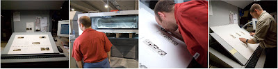
Yesterday my first photobook was printed on the presses of DeckerSnoeck in Antwerp. What a nerve-wracking affair. I was already edgy because of the important errors detected at a very late stage of the book production. We started at 5pm with the dustjacket ...

One of the important models I used for the Capitals concept is a recent book on Irving Penn's Platinum Prints (published by the Washington's National Gallery of Art, I believe). This is an understated but truly luxurious publication, finely printed and bound. I wanted my images to have a similar toning (which is very different, much warmer, than I normally present them). So a few weeks ago, Snoeck produced digital proofs based on the Penn book which I accepted. Separations of the images were made and an appropriate trichrome ink package (black - deepspace black - Pantone 465) was proposed. These settings for were used on the machines when we started to print yesterday evening. 

It soon appeared that things were not so straightforward as I expected. First, the real prints had nothing to do with the digital proofs, not even remotely. So much for digital proofs. Second problem was that none of the three cover images on the dust jacket had a similar density. From top to bottom of the sheet they got progressively cooler. The strange thing was that the colour measurement device showed that there ought to be more PMS colour in the final image than was optically evident. A mystery. So the printer decided to do only two jackets on a single sheet instead of the original three. After 4 or 5 trials we had something which looked pretty consistent across the two covers. 

The printing looked very good. But when I looked very closely with the naked eye I could see the printing screen (I am nearsighted and therefore can see awesomely sharp very close-up; never need a loupe to focus my view camera). When I was told it was a 175 LPI (lines/inch) screen I was startled as I thought we were going to print stochastically. They assured me this was what was planned. But I had a nagging doubt when I went back to their client area after I had OK'd the dust jacket. I called Eddie Ephraums from Envision Books - who designed the book - who told me that 175 LPI was probably the best choice given the characteristics of the Phoenix Motion Xantur paper and the assumedly fairly viscous Deepspace Black ink. This reassured me. After all, the printing looked good too! (Meanwhile I have checked and it appears that there is not a lot of difference between screen printing @ 175 or 200 LPI and stochastic printing). 

After a longish while the first sheet of the book interior was printed. I got less anxious. It looked really good. Pictures really sparkled. They had depth, were very, very sharp (pleasingly so, not agressively) and showed a beautiful tonal range. Never thought this could come out of my negatives! Kudos also to Johan Doumont and myself for making such excellent scans of the negatives. 

The second sheet was a downer. Two images leaned strongly towards those of the first sheet. The other four were decidedly cooler. I didn't know what to do. The chief printer assured me they had adopted identical settings as for the final version of the first sheet. Moreover he admonished me to look at the sheet as a whole, not at individual images. If we started to play with different densities for different areas of the sheet, it would be very difficult to give the people of the night shift a good base to print from. And, finally, he quite rightly pointed out that also in the Penn book there are images that look very different from one another in terms of toning. So I accepted the sheet. 

In between the second and third sheet there was a change of shift (it was 10pm by then). The new team seemed more relaxed and reacted slightly less defensively on my confusion. When the third sheet came out, they started to play with the densities of the Pantone colour to approach the final version of the first sheet as closely as possible. Not easy. Eventually we got there. By then I had the feeling that the guys of the night shift had a good idea of what I wanted and by 11pm I left them and went home. But I also had the feeling that I ought to have been more assertive regarding the second sheet.

It's an interesting experience and there is a lot to learn. One thing is the importance of the separations. They must be responsible for the difference between pictures all things remaining equal. But on what basis are these separations done. I have no idea. Another thing is the people factor. I had a more responsive partner in the night shift and it made a big difference. All this raises questions. What is the value of a wet proof if sheets can differ so much from one another at otherwise identical settings on the press? How can people have high quality art books printed in China if it is already that difficult with your own countrymen. Beats me.

It's nerve-wracking, but addictive too. The addictive thing is to see your own work in such glorious print quality. It's amazing. I already look forward to the next project. Just hope this one gets over the finish without a major accident. 

Tuesday, October 09, 2007

ragazze/o

Just in passing some soothing images from kids from friends of ours (two families). They are so used to having me hanging around with a camera that they dutifully oblige when I ask them to sit. Lovely. Taken a few weeks ago with the M4, Noctilux wide open on Fuji Reala. 

Caps ahoy

Tomorrow the Capitals book is going to be printed. It has been surprisingly difficult and nerve-wracking to shepherd the book through this very last phase. Remarkably, and despite the good care of Eddy Ephraums, I continued to find mistakes and typos until the very last moment (I even had a set of new printing plates made today because Valletta was consistently misspelled).  So, I am not sure at all what is going to come out of these printing presses tomorrow. It's going to be absolute horror when it appears that we glossed over a capital (sic) mistake somewhere. Brrr!  

è infinito ...

Over the past months I have regularly added new items to my collection of photobooks. Here are some of the more interesting books:
  • Boris Mikhailov - Unfinished Dissertation: this was a recommendation by Lorenzo Castore. I had come across Mikhailov earlier this year when visiting the Twilight exhibition in the V&A, London. I was very impressed by his series "At Dusk". "Unfinished Dissertation" is a slightly earlier work, started in 1984 when the Soviet Union was still a reality. It's a strange book, unlike any other I have seen. A hefty tome, it comes in a fairly large format, printed on a very vulgar stock of paper. On the right hand side we have what looks like facsimile pages torn from a family album, almost invariably with two pictures glued in and supplemented with handwritten comments (in cyrillic). On the left hand side there is an english translation of these comments. The pictures are ostensibly mundane. The book is shot in the vernacular. But who has read Dostojevski and Bulgakov will recognise that typically Russian/Soviet penchant for the burlesque. The comments are startlingly interesting. Haiku-like, they seem to plumb philosophical depths: "When I photograph I often, as if by chance, glimpse back", or "The quantity of things not done per square kilometer still remains the main characteristic of Russia in time." There are many more of these gems. It's a book that warrants repeated study. But that is not a burden. 
  • Boris Mikhailov - At Dusk/By the Ground: this is a diptych that comes in simple cardboard slipcase. The books are hard to find. Emma, the shop assistant at Koenig Books on Charing Cross Road was so kind to look up a set in the remaining stock at Walter Koenig's. I was very happy to be able to lay hands on them. Both volumes were shot in the years following upon the collapse of the Soviet Union. Most pictures are from Mikhailov's home town Kharkov. All were taken with an Horizon swing lens panorama camera (" ... the main advantage of this camera is that it does not moralise, but lists everything seen horizontally and to a certain extent scans the area.") In "Dusk" all pictures have been very crudely toned in cyano-blue (the blue of search lights against a dark blue sky). It's social documentary photography at its most confrontational: stark images of a collapsing society. People are lying about, vomiting, boozing, scavenging, dying. But there are images of a supreme, almost painful lyricism too. "By the Ground" is somewhat more easier to stomach. Here the toning is unabashedly sepia. Pictures were shot during the fourth year of the transformation of Russian society. Still, here too Mikhailov doesn't put on the gloves when he wields his Horizon on the streets of Kharkov. A superb collection. 
  • Michael Ackerman - End Time City: I had never heard of Ackerman before my photo workshop in Tuscany. But people spoke so glowingly about him that he has to be a remarkable person. I picked up this phenomenal book of his in a second-hand bookshop for a mere 10 euro. It's largely dedicated to the city of Benares, where many Indians come to die. A mixture of formats: square, panoramic (also Horizon), and the usual 2:3 format. The style is hard-hitting and visceral, very much in the vein of Lorenzo Castore and also of Mikhailov. Stark contrasts, exploding grain, blurriness, vignetting, extreme close-ups: it's all part of Ackerman's game. You sense he has deeply burrowed in the city's skin. Ackerman: "Classic reportage photography, with its beginning - middle - end narrative is completely boring to me. It lacks something so essential. Yet work done by certain photographers who have that restlessness, that feeling of not belonging, like Louis Faurer, Robert Frank, Leon Levinstein, Josef Koudelka, for example, I find fascinating. It is open ended. The more I look, the more I see. For me it is important to show what life feels like, not what it looks like ..."
  • Masao Yamamoto - é: this is Japanese aestheticism at its most precious, worlds apart, it seems to me, from the no holds barred ethos espoused by Ackerman and Mikhailov. I was drawn to Yamamoto by Marko Hehl, who is deep into japanese photography. No doubt this is an interesting photographer. Every one of his books is conceived as a collector's item: an idiosyncratic concept (a book as a scroll, the pillow book, a book in a box, etc), top notch workmanship, a limited edition. As a an approach I find it immensely attractive. To date, I have only one book from Yamamoto: "é" has been published by Nazraeli Press in 2005. A mere 42 pages, it comes in an oversized format, printed on a superb stock of Japanese paper. The layout of the book is striking: most of the pages are largely white, with small vignettes strewn almost haphazardly around. The pictures are a mixture of all kinds of things: scenes of nature, still life, nudes, ... Photographically I remain a little bit unsatisfied by this book. There are wonderful things - striking the right balance between a sense of wonder and delicacy - but also pictures which seem a just a trifle facile. All in all I find that the packaging promises more than what is inside. It's a little bit like the Bilbao Guggenheim: the building is so stupendous that it dwarfs whatever art is on display inside.
  • David Jimenez - Infinito: strange little book that I picked up in a second-hand bookshop. There is no text at all. It starts in medias res. Only on the back cover the name of the photographer appears, in tiny letters. Wonderful. The concept is striking. Pictures are double pages, but the spreads are sewn on top of one another so that every photo is in two parts. You have to puzzle them back together. Interestingly, each half works also on its own, however cryptic it may seem. The style is not "artistic". There's the restlessness we also find in Castore and Ackerman. The edges are rough, but not as painfully so as with the latter two photographers. I don't know where the unity in this book is. Pictures seem to come from all over the place. Not sure where the title refers to either. I guess I will have to find out myself. 
I have a few more books but will keep them for another time. 

Sunday, October 07, 2007

Foor


A few snaps from a visit to "Leuven Foor" two weeks ago ... Shot with the Hexar RF/Zeiss Biogon 28/2.8 on chromogenic Kodak BW400CN, which I haven't used before. I picked up a few rolls in Leipzig @ 3,5 euro (double the price in neighbouring Saturn). Scans very nicely, but I knew that from Johan Doumont already.

Saturday, October 06, 2007

Bina Gardens


Whilst rummaging through my files I found this one. Taken about 6 months ago in London, with the Horizon.

Fish


Touchdown after almost 3 weeks in a maelstrom of travels, workshops and meetings. There was hardly any time to "think" photography. My photo brain was sucked empty by all the stuff going on. I took the CM and a new Minolta TC-1 with me on my travels, but I didn't use them a lot. So the harvest is very thin.

Above a shot from a shop window somewhere in London. Taken with the CM on Fuji Reala. I have bought a small stock of colour film again, but I am not sure it is worth it. Problem is the scanning. I tend to go completely astray in adjusting the colour balance. So I just do "auto-contrast" and "auto-colour" ...