Mountains left and right

With the Capitals book now behind me, I've been thinking about ongoing projects and where they may lead to. The mountain photographs project has potential to grow into a new book, although there is still a lot of work to do. One thing the Capitals book has learned me is how well the combination of pictures and graphic design works. The little playful thing with the co-ordinates on the lefthand side pages really makes a difference. It adds depth and visual sophistication to the experience of browing through the book.
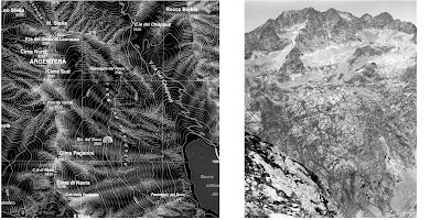
It is an interesting challenge to think about how this could be translated for the mountain book. In talking with graphic designer Alok Nandi, he suggested to use a topographic map on the lefthand side page, displaying the pictured mountain in 3D, reinforcing the notion of individuality and character, of a genuine mountain portrait. I like the idea as it again plays on the notion of topographical space on which the Capitals book was grafted.
Above is a little try-out. On the righthand side is a picture of the Monte Argentera, in the Alpi Maritimi. On the lefthand side is the corresponding section of a topographical map (1/25.000). I've inverted it, which makes more impact. The map is printed on a full page (19x19cm) whilst the picture is printed 19cm high, top and bottom bleeding, with white margins left and right. I would stick to the same layout throughout the whole book. I think this could work well.
Anyway this needs much more work. I have around 10 suitable images, but would like to collect a portfolio of about 40 photos. This year I will travel to the Karakoram, Alps and Pyrenees. Hopefully this will allow me to significantly expand the project.


0 Comments:
Post a Comment
<< Home